Address Map
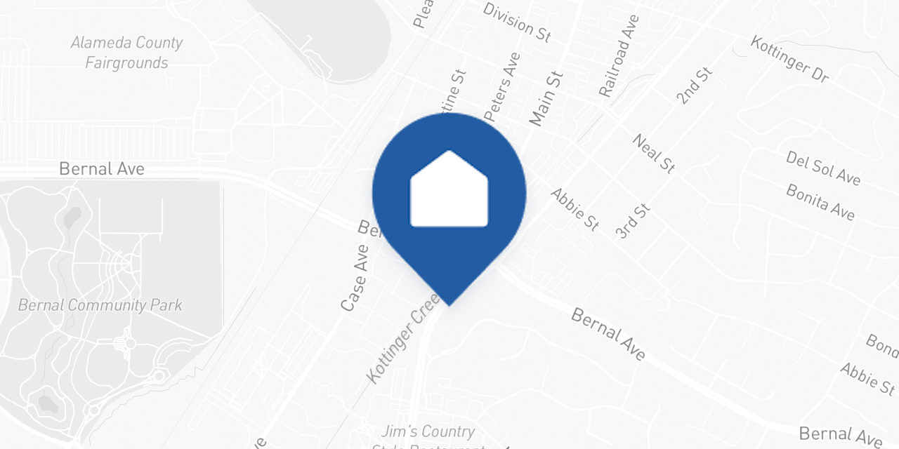
The AddressMap component renders a static map image with a pin marker for a given address. No lat/lon required - the component geocodes the address automatically via Mapbox.
This is the same map used inside the QualificationQuestions review card, extracted as a standalone component for use on any page.
Basic usage
import { AddressMap } from '@opendoor/partner-sdk-client-react';
<AddressMap address={{ street1: '123 Main St', city: 'Austin', state: 'TX', postalCode: '78701', }} onLoad={() => console.log('Map loaded')} onError={(err) => console.log('Map failed:', err.message)}/>;<script setup lang="ts">import { AddressMap } from '@opendoor/partner-sdk-client-vue';import '@opendoor/partner-sdk-client-vue/dist/style.css';
const handleLoad = () => console.log('Map loaded');const handleError = (err: Error) => console.log('Map failed:', err.message);</script>
<template> <AddressMap :address="{ street1: '123 Main St', city: 'Austin', state: 'TX', postalCode: '78701', }" @load="handleLoad" @error="handleError" /></template>Props
| Prop | Type | Default | Description |
|---|---|---|---|
address | Address | Required | Address to display on the map |
appearance | OpendoorAppearance | { theme: 'default' } | Visual theme configuration |
mapboxAccessToken | string | Built-in token | Override the Mapbox access token |
mapPinMarker | string | Blue home pin | Custom pin (Mapbox spec or image URL) |
width | number | 640 | Map image width in pixels |
height | number | 320 | Map image height in pixels |
zoom | number | 14 | Map zoom level |
borderRadius | string | Theme default | CSS border-radius override |
onLoad | () => void | - | Called when the map image loads |
onError | (error: Error) => void | - | Called when geocoding or image load fails |
In Vue, props use kebab-case in templates (e.g., map-pin-marker, border-radius). Callbacks become emits — see the events table below.
| Prop | Type | Default | Description |
|---|---|---|---|
address | Address | Required | Address to display on the map |
appearance | OpendoorAppearance | { theme: 'default' } | Visual theme configuration |
mapbox-access-token | string | Built-in token | Override the Mapbox access token |
map-pin-marker | string | Blue home pin | Custom pin (Mapbox spec or image URL) |
width | number | 640 | Map image width in pixels |
height | number | 320 | Map image height in pixels |
zoom | number | 14 | Map zoom level |
border-radius | string | Theme default | CSS border-radius override |
Callbacks & Events
| Callback | Type | When it fires |
|---|---|---|
onLoad | () => void | Map image loads successfully |
onError | (error: Error) => void | Geocoding or image load fails |
In Vue, callbacks are emitted as kebab-case events instead of onCamelCase callback props:
| Vue emit | Payload | When it fires |
|---|---|---|
@load | — | Map image loads successfully |
@error | Error | Geocoding or image load fails |
How it works
- Loading: Shows a grey background while the address is geocoded
- Geocoding: Converts the address string to coordinates via Mapbox Geocoding API
- Static image: Builds a Mapbox Static Images URL with the pin at the geocoded coordinates
- Fade-in: The map image fades in smoothly when loaded
- Error handling: If geocoding fails, the grey background remains and
onErrorfires - you handle the fallback
Customization
Custom pin marker
// Mapbox built-in marker<AddressMap address={address} mapPinMarker="pin-l-star+ff0000" />
// Custom image URL<AddressMap address={address} mapPinMarker="https://your-cdn.com/pin.png" />
<!-- Mapbox built-in marker --><AddressMap :address="address" map-pin-marker="pin-l-star+ff0000" />
<!-- Custom image URL --><AddressMap :address="address" map-pin-marker="https://your-cdn.com/pin.png" />Custom dimensions
<AddressMap address={address} width={800} height={400} zoom={16} /><AddressMap :address="address" :width="800" :height="400" :zoom="16" />Error handling
<AddressMap address={address} onError={(err) => { // Show your own fallback UI setShowFallback(true); }}/><script setup lang="ts">import { ref } from 'vue';
const showFallback = ref(false);
const handleError = (err: Error) => { // Show your own fallback UI showFallback.value = true;};</script>
<template> <AddressMap :address="address" @error="handleError" /></template>Styling
The component uses the appearance prop for theming. The border radius defaults to var(--od-border-radius-inner) from the theme, or you can override it directly:
<AddressMap address={address} appearance={{ theme: 'minimal' }} borderRadius="12px"/><AddressMap :address="address" :appearance="{ theme: 'minimal' }" border-radius="12px"/>The container maintains a 2:1 aspect ratio by default and fills the width of its parent. The map image uses object-fit: cover to fill the container.